How to Make Your Website Mobile-Friendly
With the launch of the first version of “what we’d consider a smartphone,” named Simon, by IBN, smartphones have moved from an expensive and thrilling new technology to an ordinary part of our everyday lives. However, 28 years ago, no one would have dared to predict that individuals staring at their phones would become a common sight. If your website is not movie friendly, then it is far past time for you to make it websites mobile-friendly to remain competitive in the digital age.
Did You Know?
It was not until the summer of 2015 that Google mobile searches surpassed desktop searches for the first time ever, and they’ve only gone up since then. If you are reading this post, chances are you are already aware of how important a mobile-friendly website is and are searching for ways to ensure that mobile users who access your website have a positive experience.
What is a Mobile-Friendly Website?
A website is said to be mobile-friendly if it is built to look great and perform the same way regardless of the device used to access it. This means that the website’s design has to adapt to fit on smaller displays. Each component needs to be easily accessible and presented in a polished manner across all mobile devices. Additionally, a website must have a fast loading speed to become mobile-friendly since it often runs via slower 3G or 4G networks rather than the faster local home Wi-Fi or wired connection.
Why Does a Website Have to Be Mobile-Friendly?
The majority of users connect to the internet via their mobile devices. A website compatible with mobile devices is essential to communicate with this prospective customer base. Additionally, the revenue from sales made via mobile commerce is projected to surpass $10 trillion by 2025 (three times more than 2021). This indicates that a mobile-friendly website is key in taking your business to new levels of success.
Ask Yourself: Is My Website Mobile-Friendly?
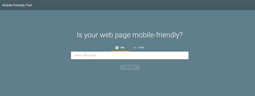
If you hired an experienced website developer to build or modify your website, the professional might have had the mobile experience at the top of their mind. However, before you invest your time and energy into thinking about how to make your website mobile-friendly on different devices, first evaluate how well your website is functioning presently. Drop your URL in Google’s Mobile-Friendly Test to see whether or not the biggest search engine on the planet thinks your website is mobile-friendly. The resulting report can help guide you as to things you can do to improve your website’s mobile user experience.
To make your website mobile-friendly, you’ll need to:
- Choose a mobile-friendly and responsive website theme or template.
- Scale back your content to accommodate the mobile view.
- Carefully balance the ‘virtual weight’ by utilizing light elements.
- Avoid technologies that mobile devices don’t support.
- Change button size and placement so a user can interact with them.
- Evenly space out links/hyperlinks for a seamless mobile-user journey.
- Test out font size on the mobile version to make sure it is readable for the user.
- Eliminate unnecessary pop-ups to avoid triggering users at key moments.
- Test periodically and play around with the appearance of individual pages.
So there you have it: everything you need to know about making your website mobile-friendly. With just a few tweaks and turns, you will be better able to target potential customers in this day and age. Simply put, keeping your website up to date reduces friction, which in turn may enhance the number of conversions your business generates. It’s a victory for everyone involved.
The Final Takeaways
When launching a website, you simply cannot afford to ignore the needs of mobile users. Mobile is here to stay, and you must ensure that your website is properly designed so that your company’s website looks good on all mobile devices, and is optimized for the mobile user. Over the years (28, to be specific), professional web developers at Web Development Done Right have prioritized the art of mobile-friendliness in all client projects. Considering that mobile development can be complicated, work with us to ensure that you get a website that suits your needs.


